Weblife Console
Weblife Console: Secure, Empower & Simplify Web Access
Carve away the unnecessary and shape what is needed.
“I already have a thousand tools I use to protect my network, so make it simple.”
During this project, I learned to whittle things down to what is needed. After speaking with our users, experts in the field and researching common trends in information security tools we decided that we needed a lightweight, easy to use and fast to implement tool to reduce the barriers to entry. Technology staff is already weighed down by the numerous tools it takes to keep their information safe and secure. What they like to see are tools they can add to their toolkit without needed much extra effort or support. We started by thinking about everything they could want, or need and then using the idea behind the 80:20 rule we whittled it down to what was necessary. Like a sculptor starts with a large and cumbersome object, then carves it down to a beautiful and poetic shape.
User Goals:
- I already have a ton of software, so this needs to be simple and fast to implement.
- I want a tool that requires limited support resources.
Business Goals:
- Provide a backend admin tool that shows the value of our product.
- Provide a backend admin tool that allows technical staff to activate their own accounts/domains and user endpoints.
- Keep the users anonymous.
Hypothesis:
By creating a lightweight, easy and fast to use administrative tool, we can decrease our barrier to entry.
Give them what they want!
To begin the project I sat down with information security experts in the field and performed a card sort. First I had them write on index cards what features they expected and what tasks they would need to perform. I had them dream big and call out as many options as they could. After they had named the tasks and features we organized them into like categories. At this point, I realized we had too many features and that if we designed a product with this many features we would not be keeping to our goal of simplicity. How could we give them what they wanted, while keeping the product simple?
We took the results and started subtracting the features that weren’t absolutely necessary to manage a company's users and ended up with a very simple list.
- Dashboard - For viewing activity and reinforcing the value of the product.
- Admins - This allowed other admins to be added to the system.
- Domains - The customer started with one whitelisted domain, but was able to add more through this feature. As they whitelist more domains, more user endpoints are brought on board.
- My Account - This included the typical items such as login/logout, help, and account billing.
We cut the features and capabilities below from the minimum viable product for a number of reasons including the following: they went against our goals of anonymity, created large and complex problems to solve, and took more development time than we had available.
- Personalization/My Profile - Since the tool is meant to be rarely accessed we felt this was unnecessary for the product at this time.
- Logging - While some companies may want this in the future, we felt it went against our goal of user anonymity. Bringing this on now would be a broad and complex problem to solve.
- Individual User Management - By whitelisting a domain all users from that domain will get access. Admins can send employees the Weblife URL, and they can then access the product. Not including this capability also avoided the broad and complex issue of anonymity. While much of this is solved by hashing emails, it caused other processes to be complicated, and cumbersome for the admin user. By using domains, the need for a sophisticated user management interface was no longer needed.
- Controls and Filters - This item was painful to cut from the list and will most likely be added in the very near future. For now, we decided that Weblife would handle the controls and roll out these additional features in the future, avoiding extra development time we didn’t have to give at the moment.
- Policy Groups - This is another feature that will be added at a later date. While it’s nice for admins to be able to control what websites users can access, it’s not necessary to meet our primary goals and saves development time for our core product infrastructure.
The Dashboard
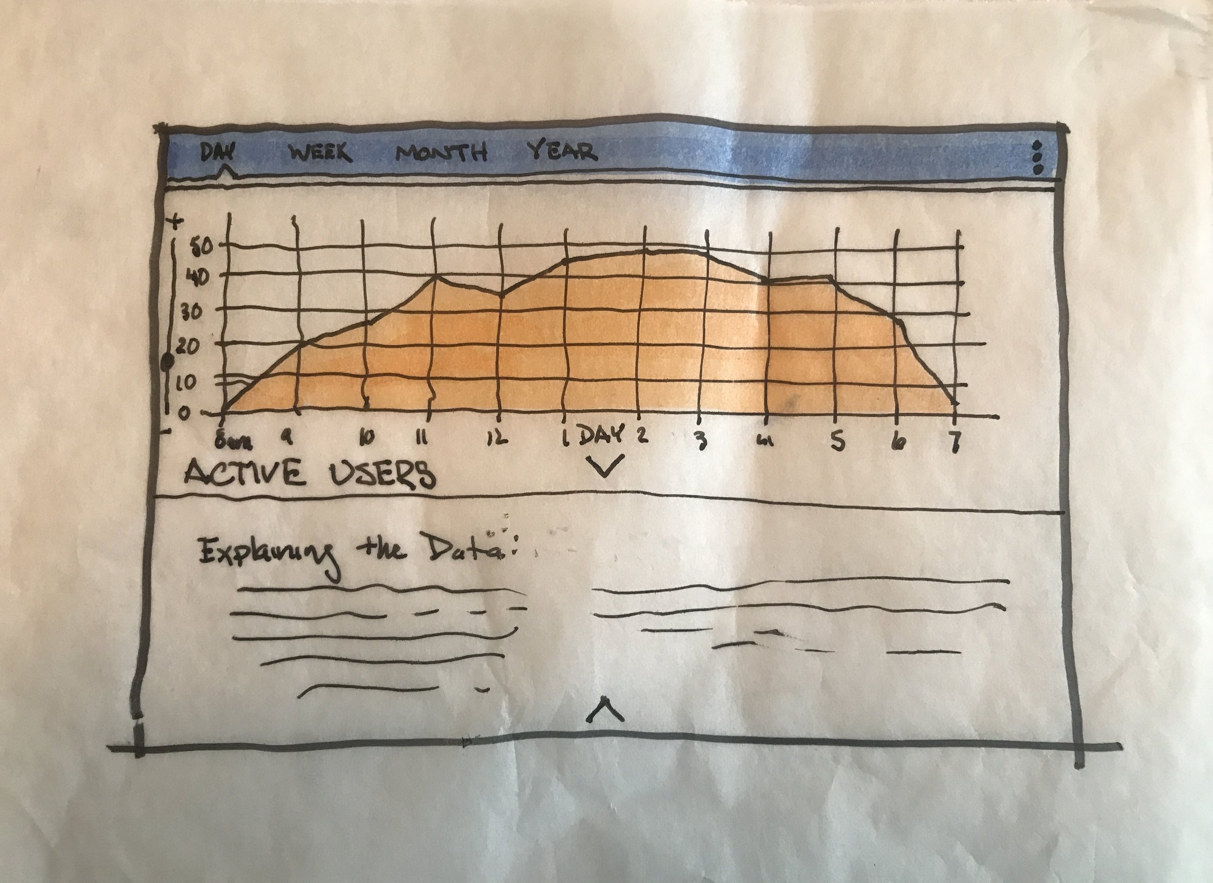
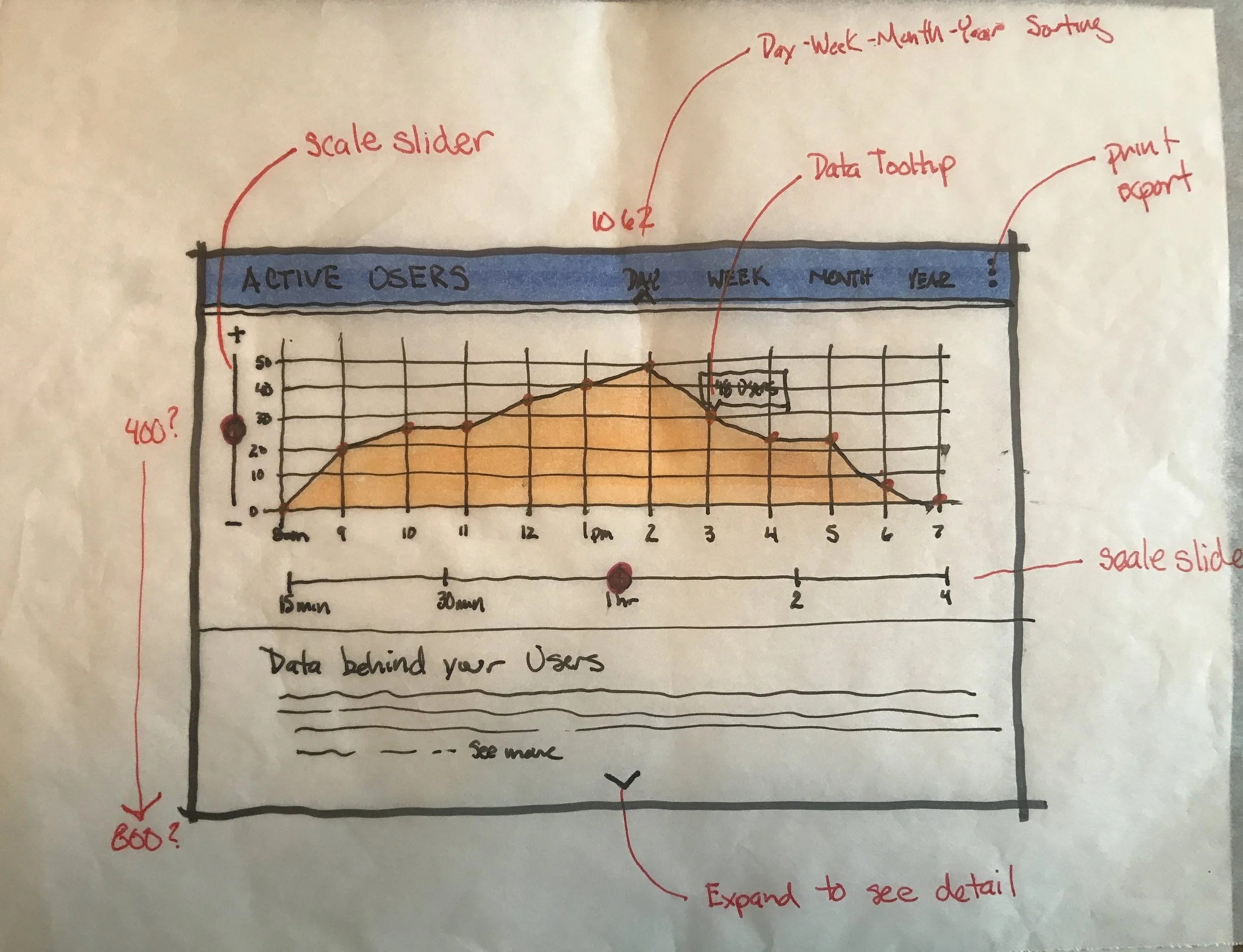
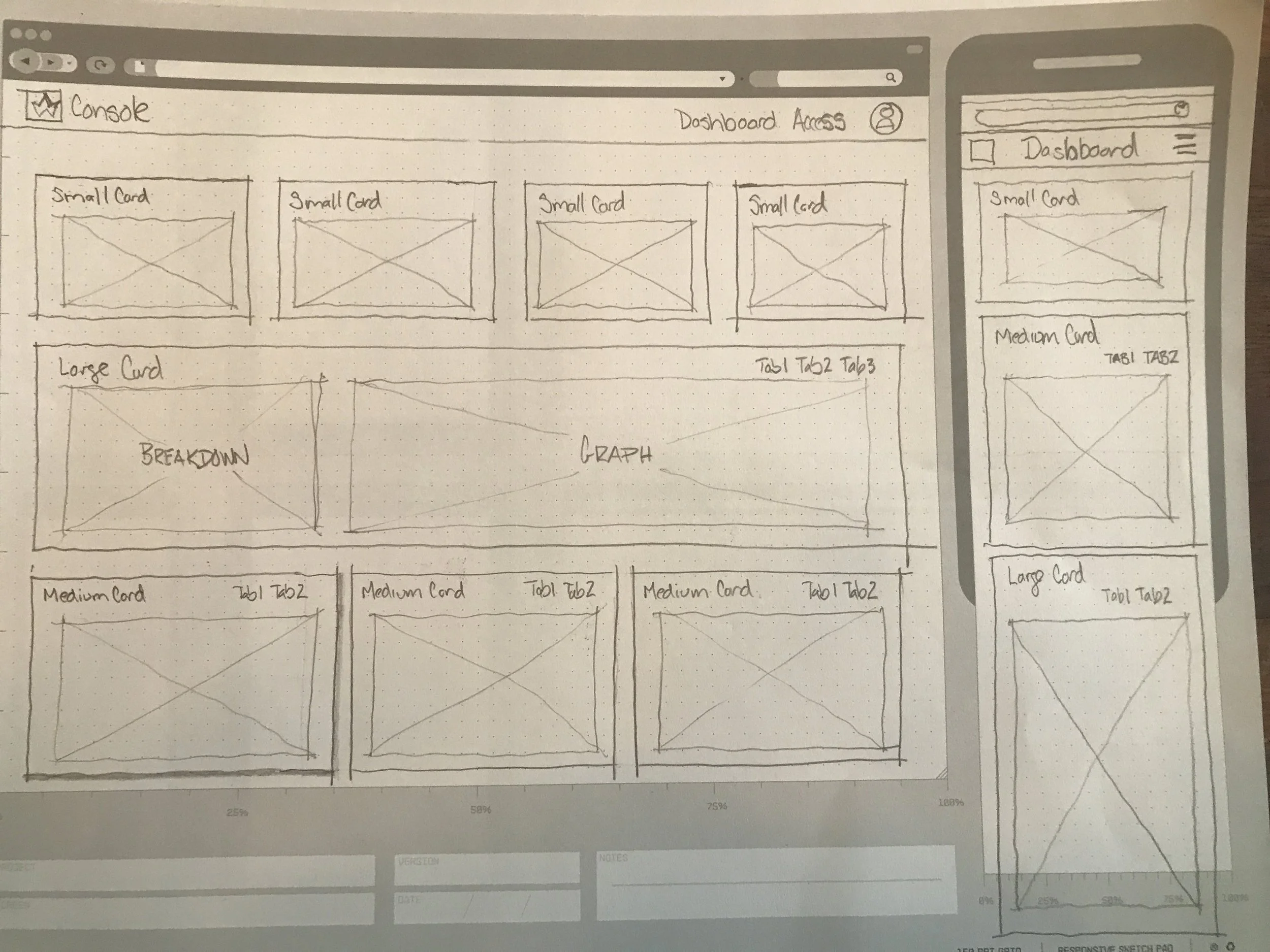
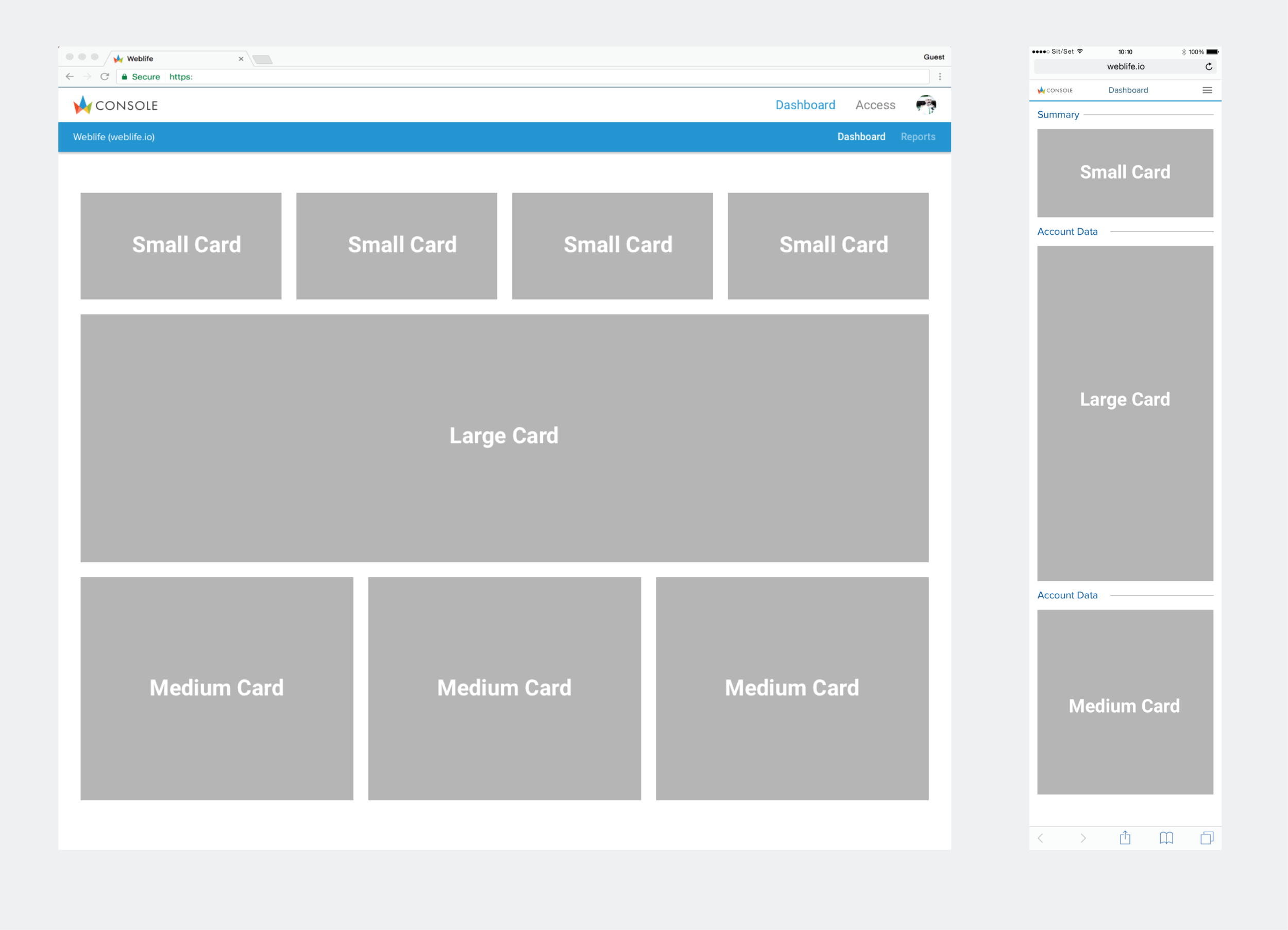
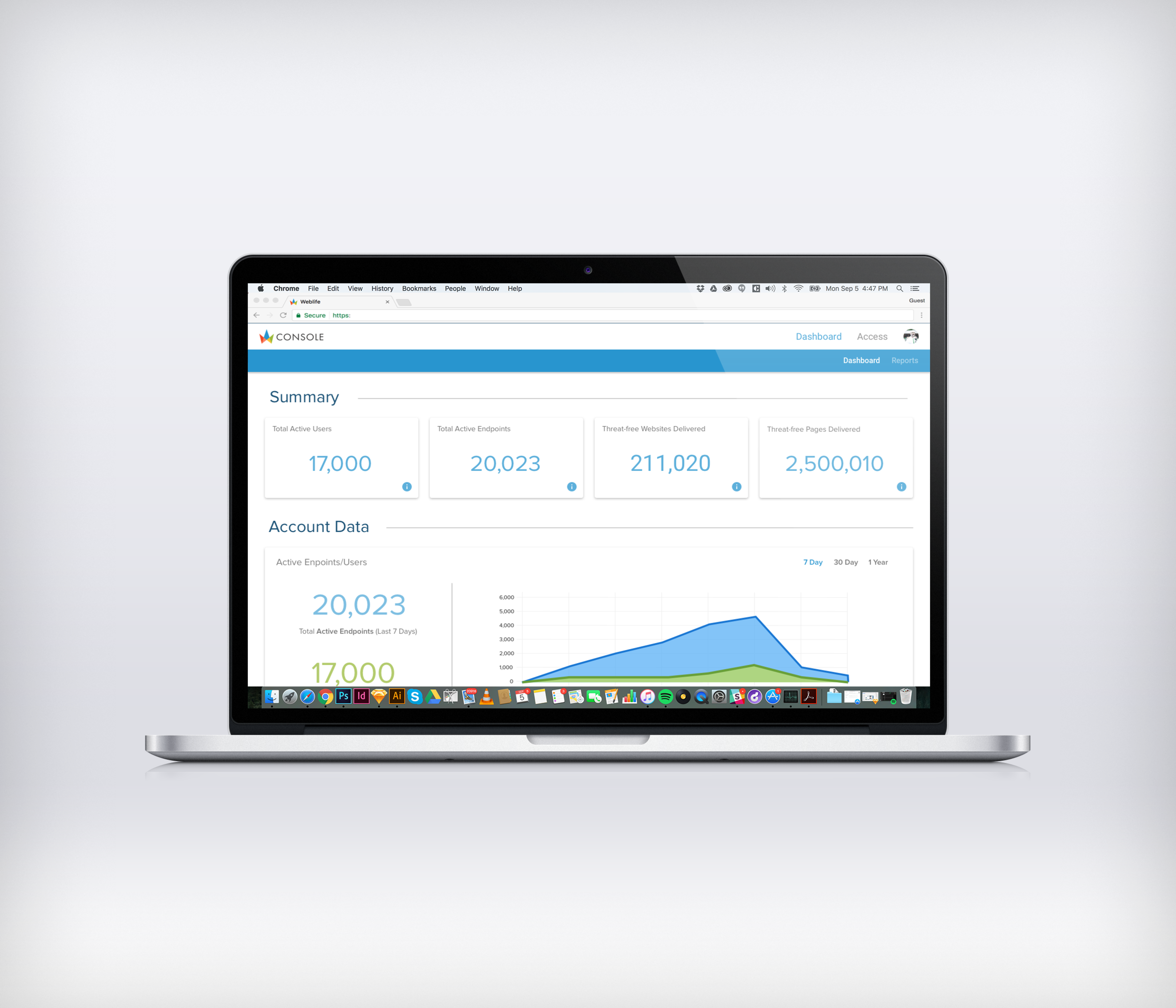
With the dashboard, we wanted to provide the users with visuals that conveyed the value of the product along with information about usage and activity. As explained previously, this product is not meant to be used heavily, so we were looking at this Dashboard as a simple and straightforward landing page for the console. After doing research on dashboards we came up with three sizes of cards to mix and match in the following data categories.
- Summary Data - A quick glance at what is happening.
- Account Data - Information about their account.
- Threat Data - Show how many possible threats have been prevented.
- Activity Data - Show types of sites are being visited.
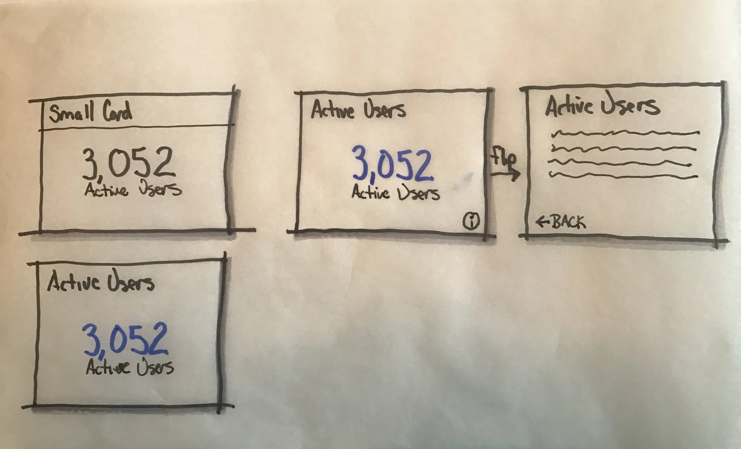
Small Cards - These cards would provide very basic information in the form of a number. No graphs, images or sorting capabilities. These cards would all be of the small version.
- Total Users
- Total Endpoints
- Threat-free Websites Delivered
- Threat-free Pages Delivered
Medium Cards - Medium cards are much like the small cards, but compare two items in number form and can have toggling options.
- Upload Attempts Prevented
- Download Attempts Prevented
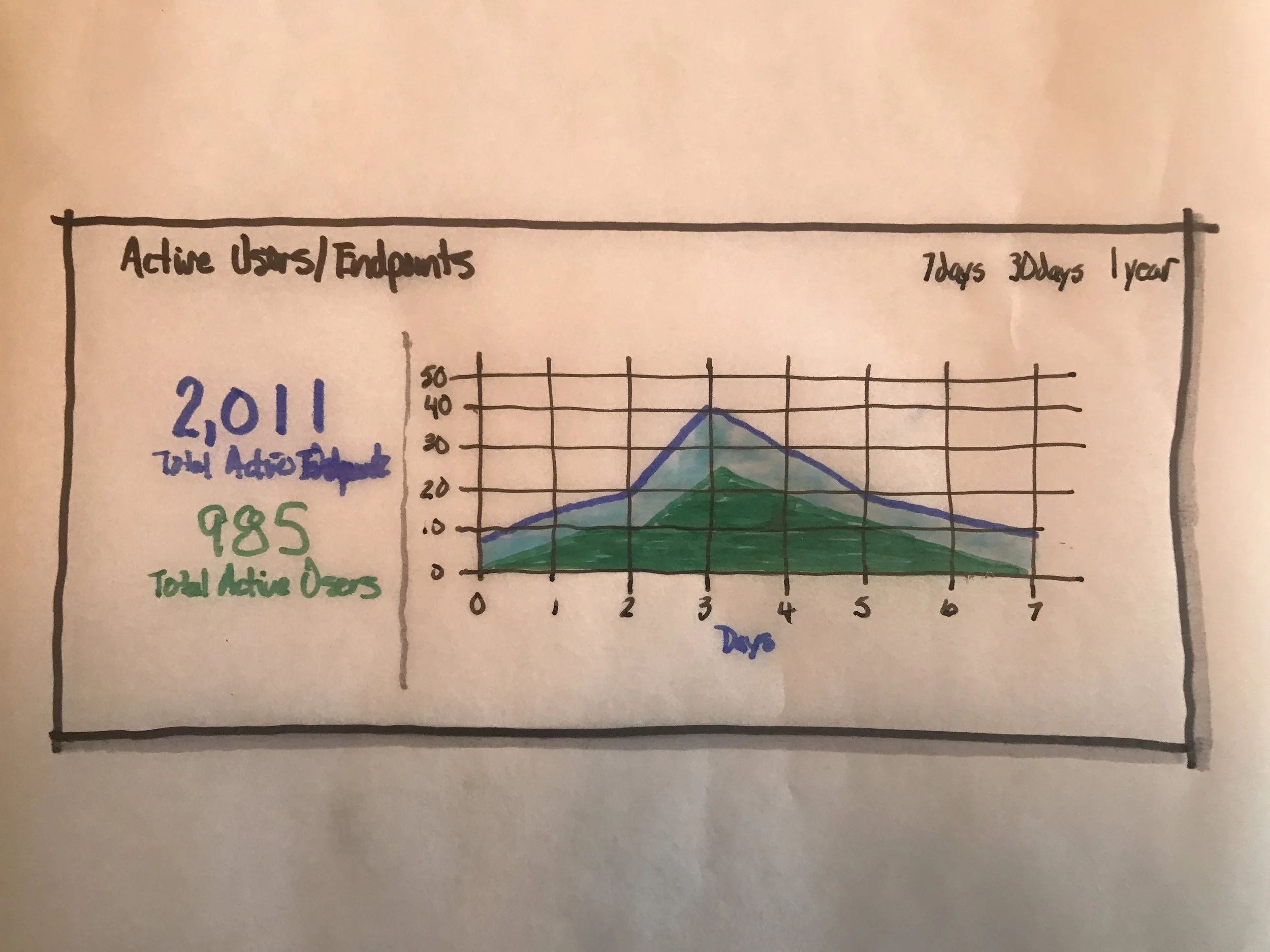
Large Cards - Large cards can combine information to show comparisons in graph form. They can also have more complex toggling/filtering options.
- Active Endpoints/Users
- Threat-free Content Delivered
Sketching the Layout and Cards
Laying out the Cards and Navigation
Possible Card Layouts
Dashboard Design Desktop and Mobile
Dashboard Layout with Navigation
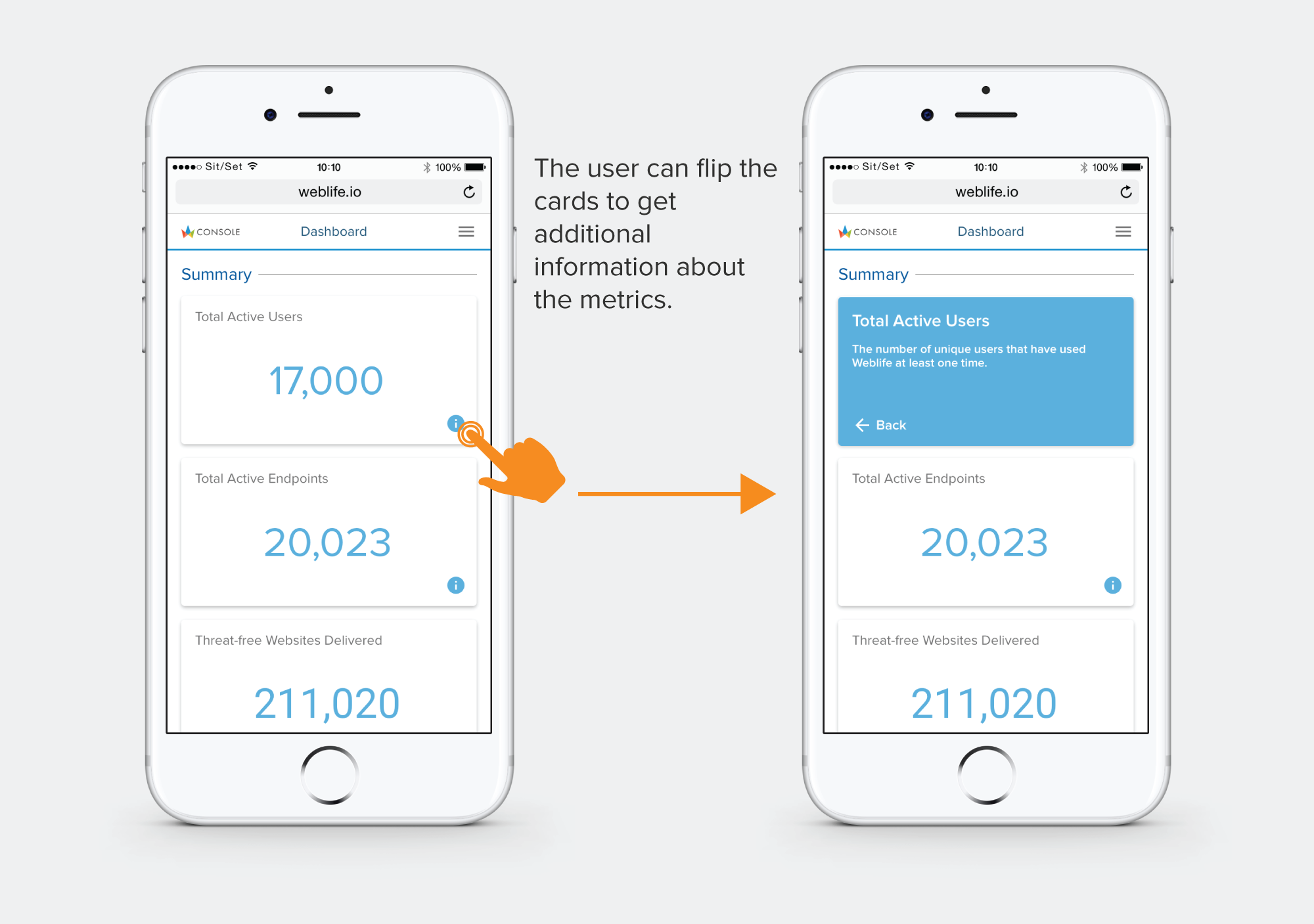
The Card Flip
Card Flips to Show Additional Information
Add and Edit Admins
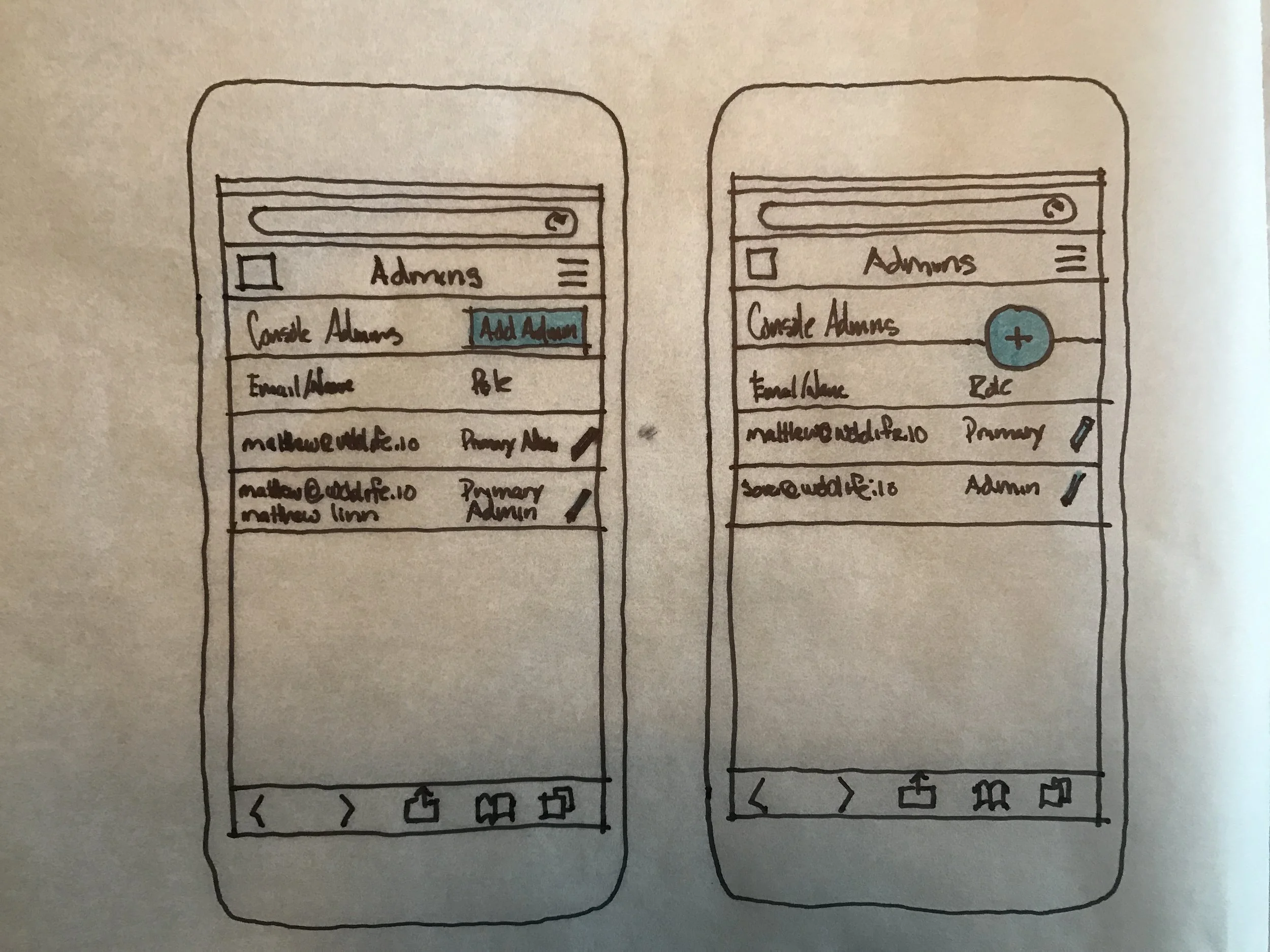
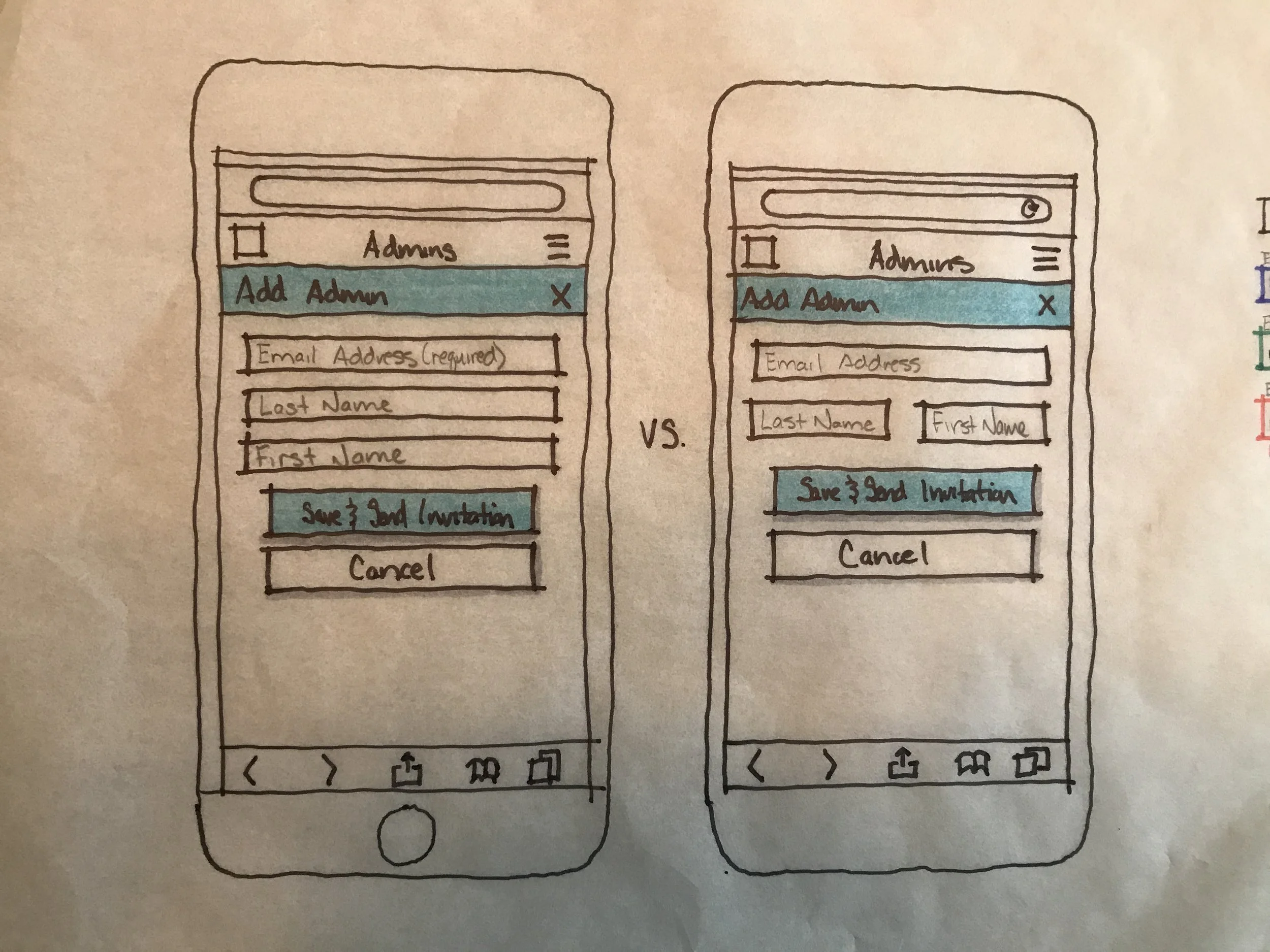
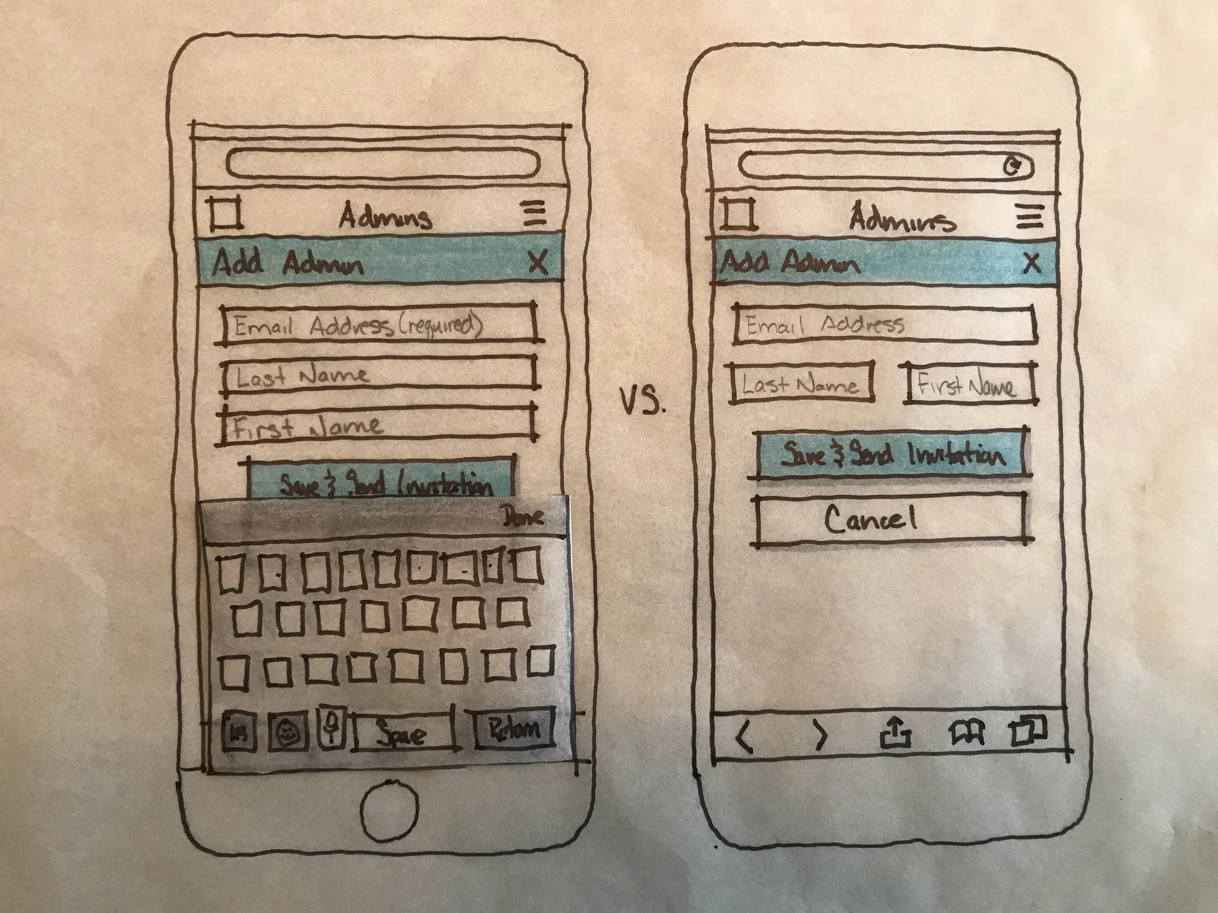
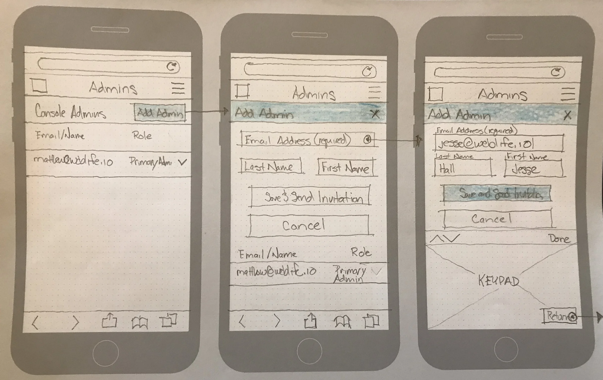
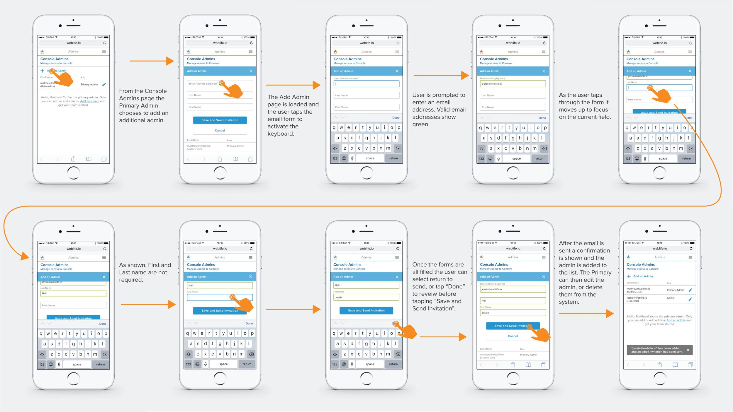
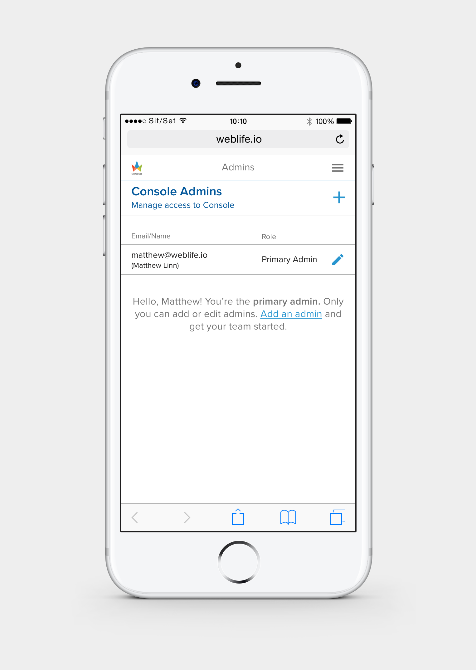
Once the account was set up and the Primary Admin has logged in to the Console they are able to add additional admins to the system. Admins that are added to the system are able to do everything the Primary Admin can except for editing of the primary admin. Below are flows showing how to add and edit an admin. I started the process by sketching out options and then moved to Sketch to really get into the pixels.
Add Admin Flow Sketches
Add Admin Flows
Add an Admin Mobile Flow
Add Admin Origami Prototypes
During the design process I used Origami Studio to nail down the interaction. As shown below in options 1 & 2 the metaphor didn't fit. Options 3 & 4 were more successful and after testing I landed on Option 3. Origami is a very powerful tool for exploring options during design and also for communicating with stakeholders and developers. It continues to be a tool I used more often and earlier in the process.
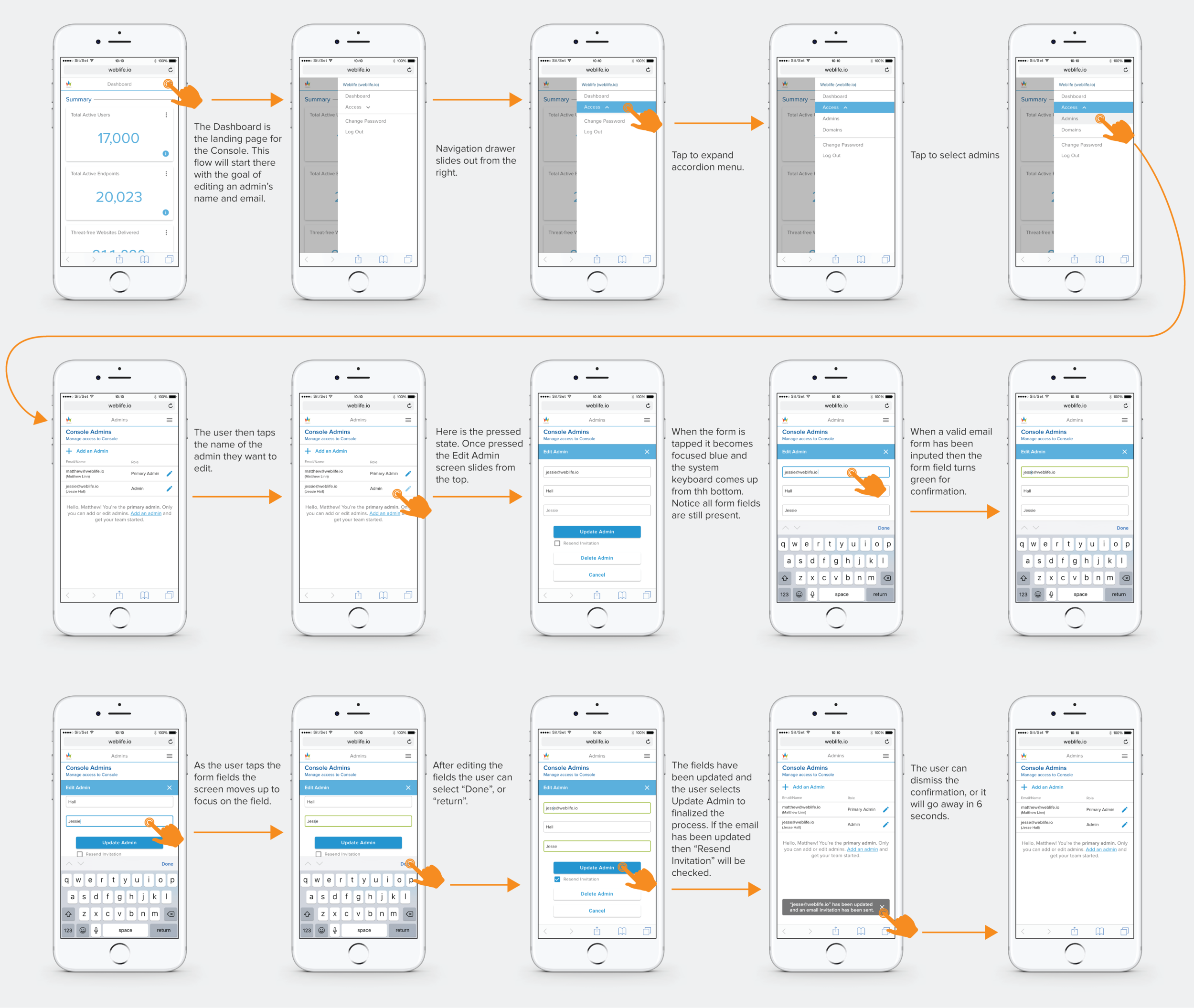
Edit Admin Flow
Edit Admin Mobile Flow


