Weblife Rebrand

Design Principles
When I started working for Weblife, not only did the products need design attention but also the branding and visual design. One of the first steps was to sit down with the team and decide on who we were and what we wanted our clients to see. I used the following design strategies to help create a brand, logo and color pallette for Weblife.

Descriptors Explained
- Leadership - Be a thought leader in the vast security landscape.
- Maturity - Graphically show that we are a serious player.
- Strength - Be bold and confident.
- Trust - Instill trust through branding, identity, and color.
- Safety - Above all, it needs to breathe safety.
- Transparency - Be an approachable security company.
- Fun - Make the branding and products a delight to look at and use.
The Color Palette
I put together myriad color palette options for the stakeholders to choose from. The following palette was chosen for following the design principles laid out above. The stakeholders felt that it best represented Weblife and our mission.
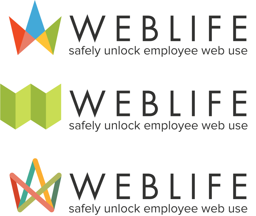
Logo Options
After a few rounds of sketching and discussion our options I landed on a few finalists to choose from. I tried out different variations of them without showing the stakeholders too much.
Business Cards and Swag
Once the logo was chosen and logo assets were created I moved on to creating our business cards, marketing materials and t-shirts.


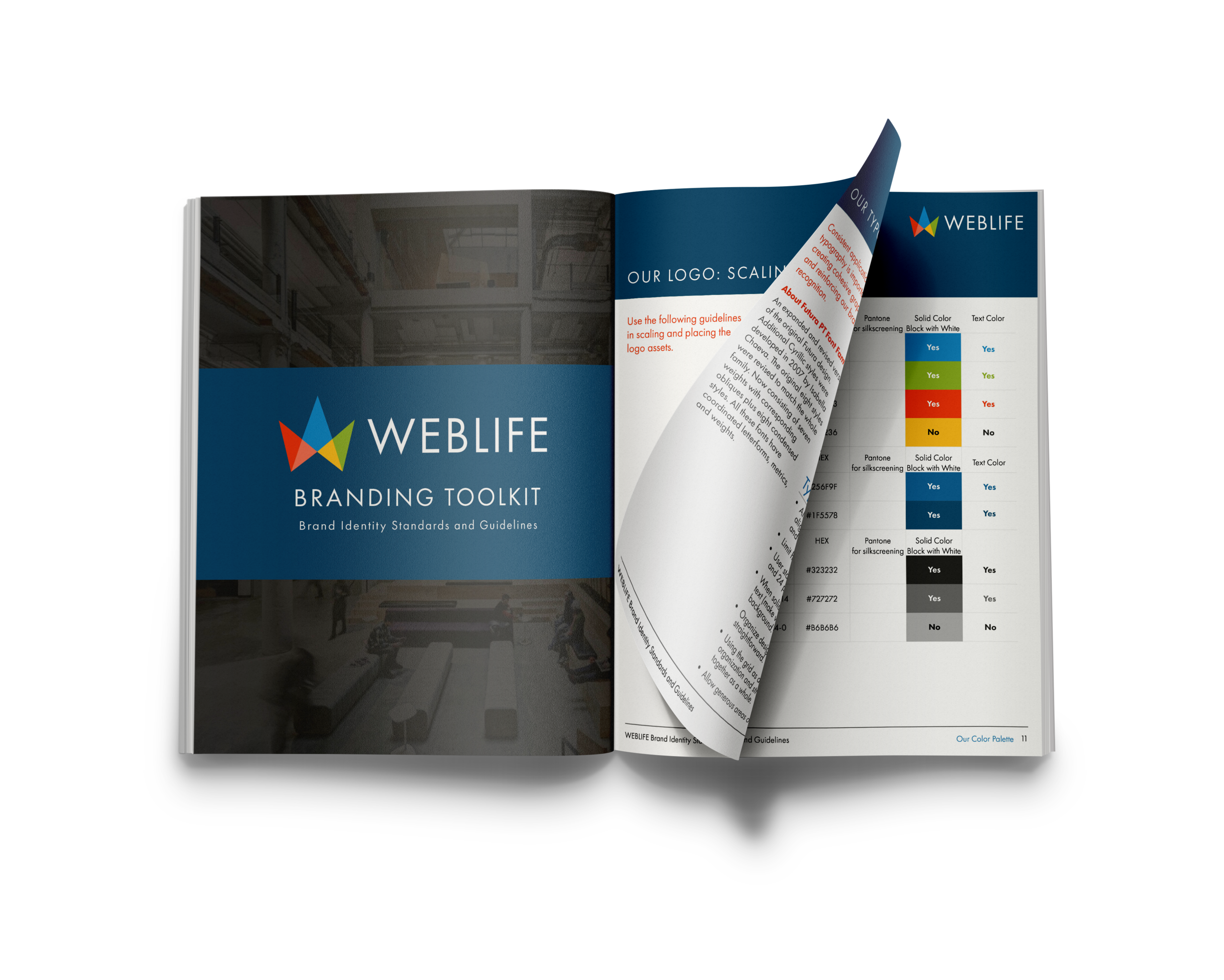
Branding Document
The final step in the branding process was creating all the necessary logo assets and a document that would show the team and other designers how to use our assets, do's and don'ts and layout principles for print and digital applications.