Weblife Browser
Secure, Empower & Simplify Web Access
“We know this product isn’t perfect, so help us make it better. In return, we provide you with security, privacy, and anonymity.”
Why are we doing this? How does it work?
Weblife Browser was my first product design project after coming on at Weblife. After going through a rebranding of the company, I immediately jumped into the process of designing the Weblife browser. The idea from a development side, which I must speak about in a general way, was to have a web-based browser that removed malicious content on the weblife side so the user had a safe browsing experience. This allowed large companies to grant their employees access to the internet without the threats of malicious code. While this presented many unique challenges, it also made for a fun problem to solve.
From a UX perspective, we wanted to secure, empower and simplify web access while selling some of the weaknesses of the product as strengths and owning any faults we couldn’t hide by offering a feedback loop. We strived to be open and honest while selling a new and innovative security product. Here is how it works (some information has been intentionally omitted per non-disclosure agreement).

Web-based Browser for the win! Now for a reset.
Although we knew we could create a good browsing experience similar to other browser clients, we had the issue of it not being a stand alone browser. We would have to create a seamless browsing experience from within multiple browser types and keep the users from navigating away from our product. Before I joined, the product team had been developing the product, but we decided to have a reset and take a careful and empathetic look at the web-based browser.
User Goals:
I want a seamless browsing experience, similar to my default browser.
- I want to browse the websites my company currently has blocked.
- I want a safe, secure and anonymous browsing experience.
Business Goals:
Minimize risk to companies and their employees by offering a browsing experience that allows for privacy, security, and anonymity.
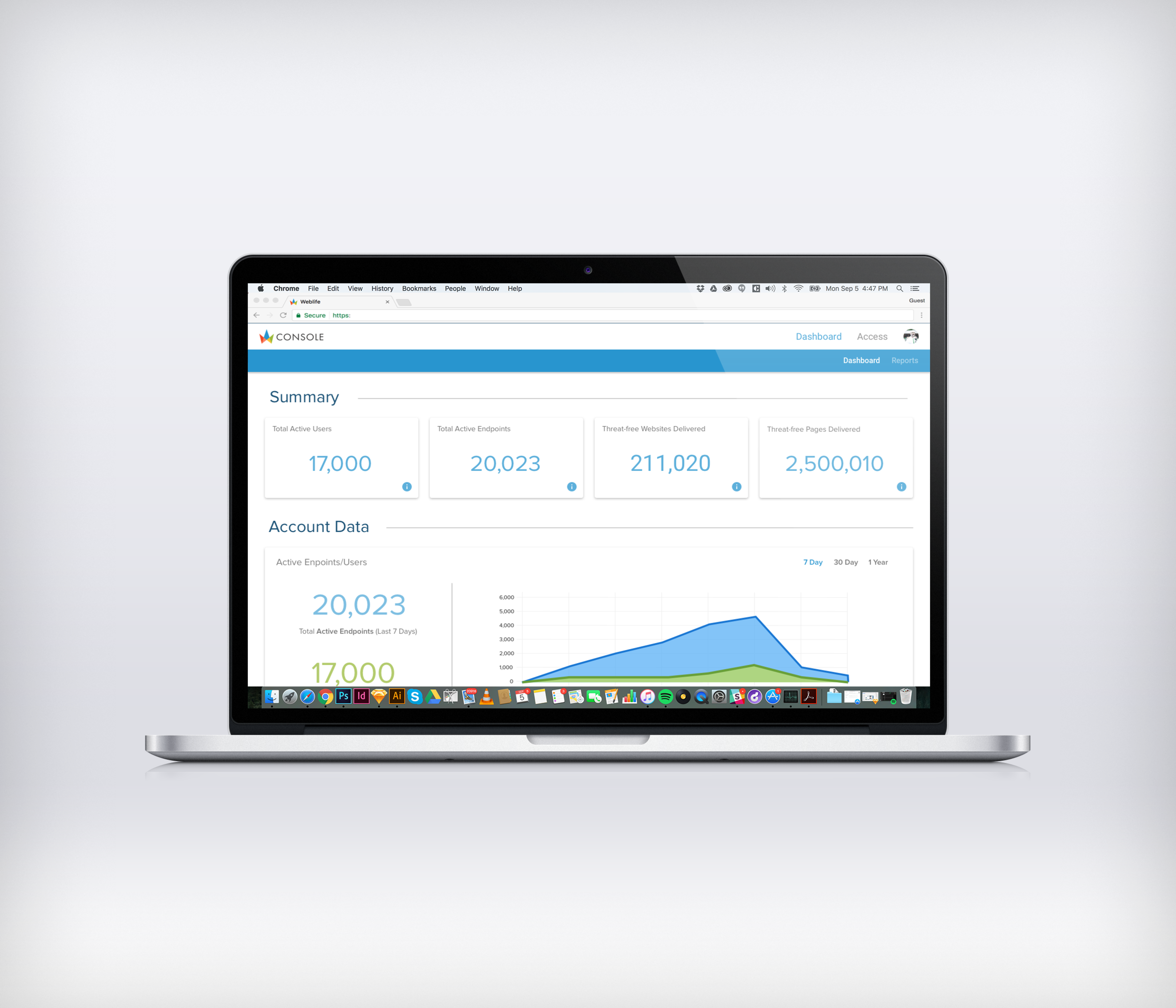
- Increase Weblife Active Users to 100,000 by the end of 2017. (Currently at 10,000 Active Users)
- Simplify provisioning and access to Weblife.
Hypothesis:
By creating a contrast between the two browser bars, we can keep the user focused on the Weblife browser bar and decrease the likelihood of users browsing away from the product.
- By harnessing the power and familiarity of existing browsers we can create a more seamless browsing experience for our users.
Who are these people?
Before jumping too far forward with the design, I wanted to figure out who I was serving. Since we were serving Fortune 500 companies, our base of users was rather broad with the median age at companies ranging from 26-50 years of age and fortune 500 companies employing 27 million employees nationwide. With no budget for surveys to gather data, we approached the personas using an ad-hoc method blended with interviews of existing clients. Sitting down with the team we created the following:


What do they want and expect?
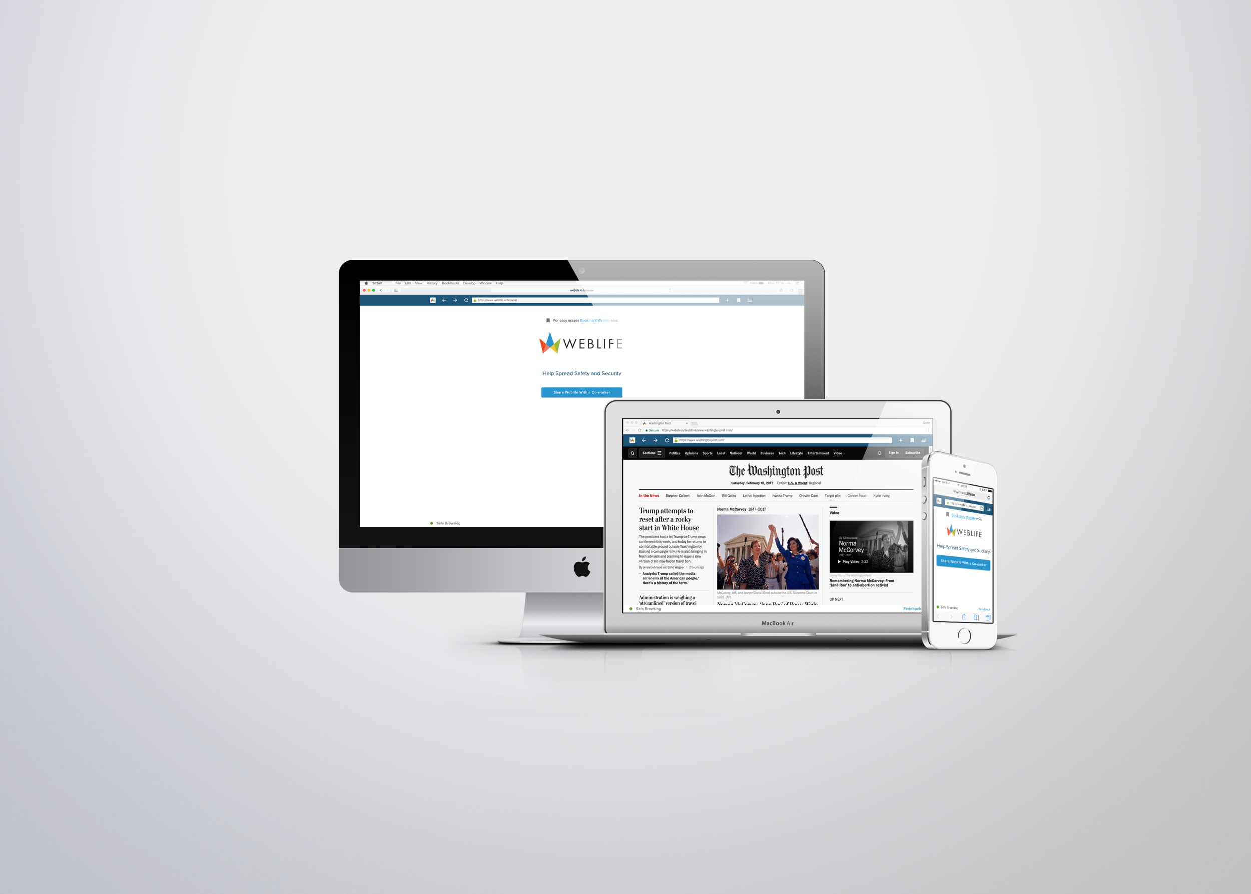
The first segment of the process was to create a browser to cover the needs of our users. I used Chrome and Safari for desktop and mobile web, as Chrome and Safari are widely used browsers for the different device types. Many of our users come from fortune 500 companies, so I also considered IE11 and Edge. Relying on precedent was important, due to the time constraints of the project. The desktop version was laid out similar to Chrome with additional spacing to help provide more contrast. The mobile versions would be similar but without the navigation arrows and additional features falling under the hamburger menu.


Testing Contrast and Usability
After laying out the basic needs of the Browser Bar, I decided to test out my hypothesis and see if the contrast helped. Below are layouts of the different browser types with our web-based browser bar laid out below it in gradients of black (dark to light). My goal was to see which one was easiest for people to read. After narrowing it down to the darker shades using a preference test, a developer built the browser bar so we could test it on users. Coding up a prototype that could be tested in a real browsing experience was important here.


Mobile Browser w/ Facebook
Mobile Browser w/ Brand Blues
Desktop Browser w/ Facebook
Desktop Browser w/ Blues
After the preference tests, I applied our brand blues to the URL bar knowing that people preferred the darker shades. People preferred the option checked above, but that was mostly due to showing it with Facebook. Looking at the bar with other websites led us to go with our dark brand blue color instead. In the future, I would include more websites for the preference test, so as not to present bias. Once the URL bar was built, we were able to test users in an actual browsing scenario. The dark bar was largely successful during the usability tests, fit with our branding guidelines better, and the product team preferred it.
In the videos below I use Chrome Inspect to quickly change out the colors during testing. When you have little budget you have to be creative.